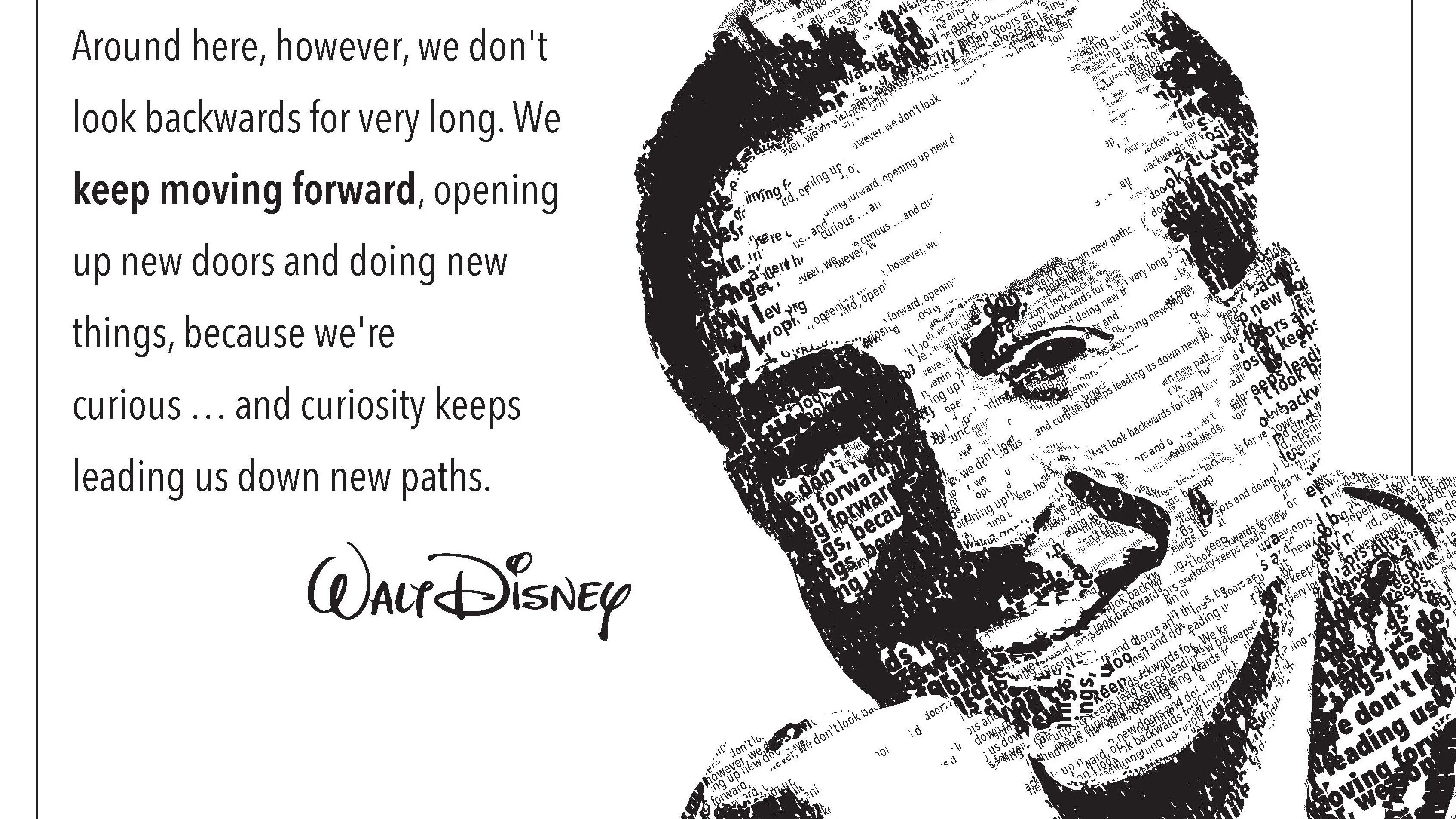
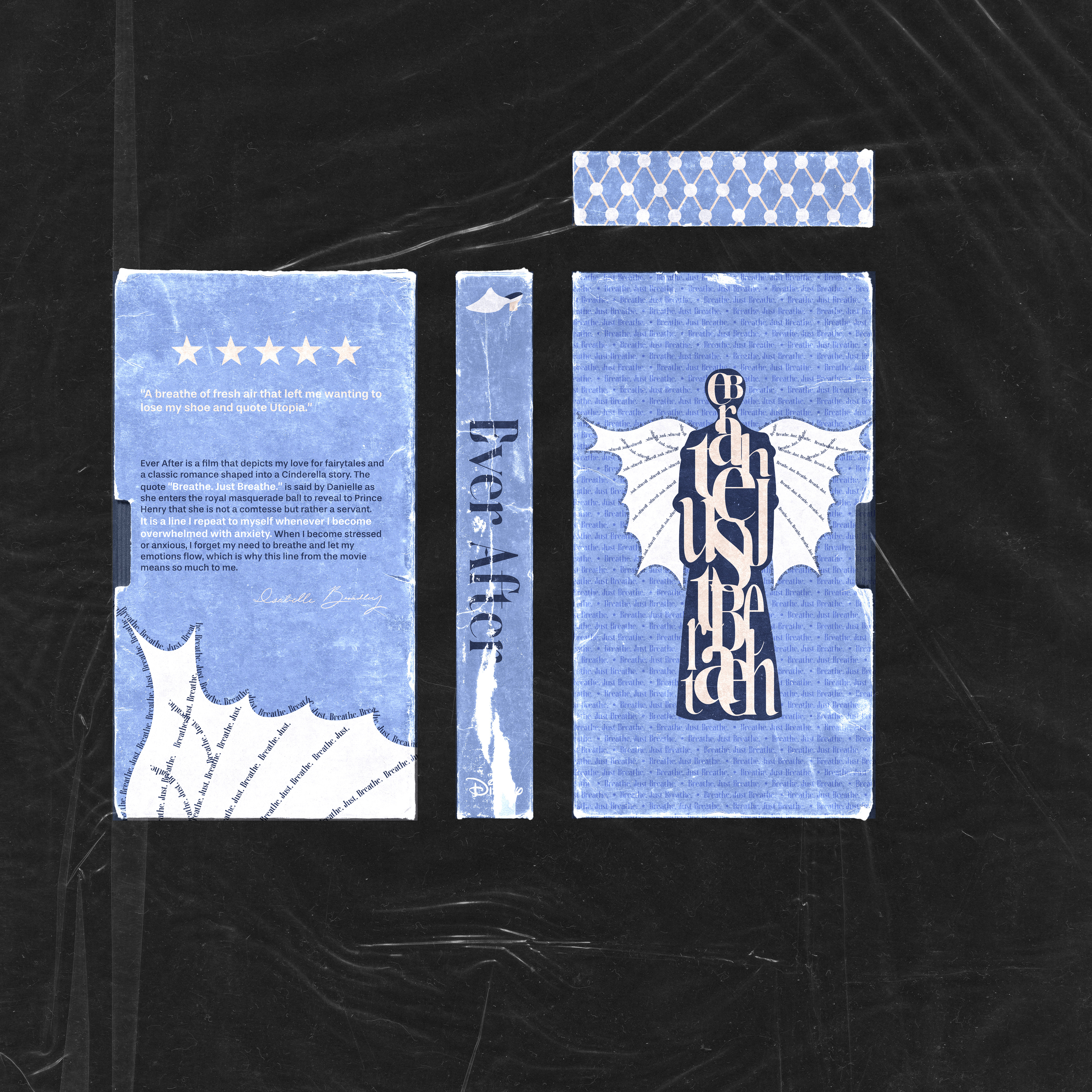
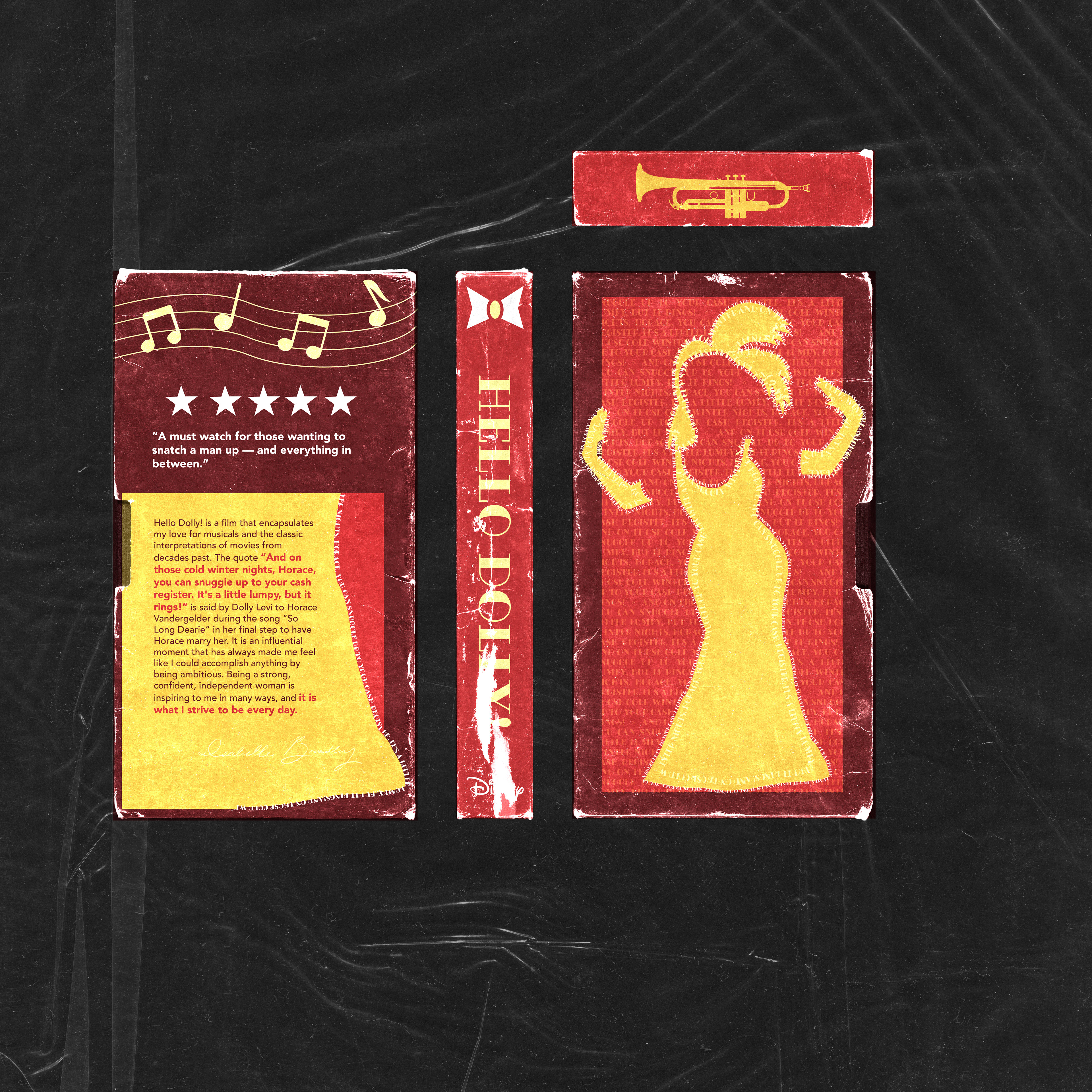
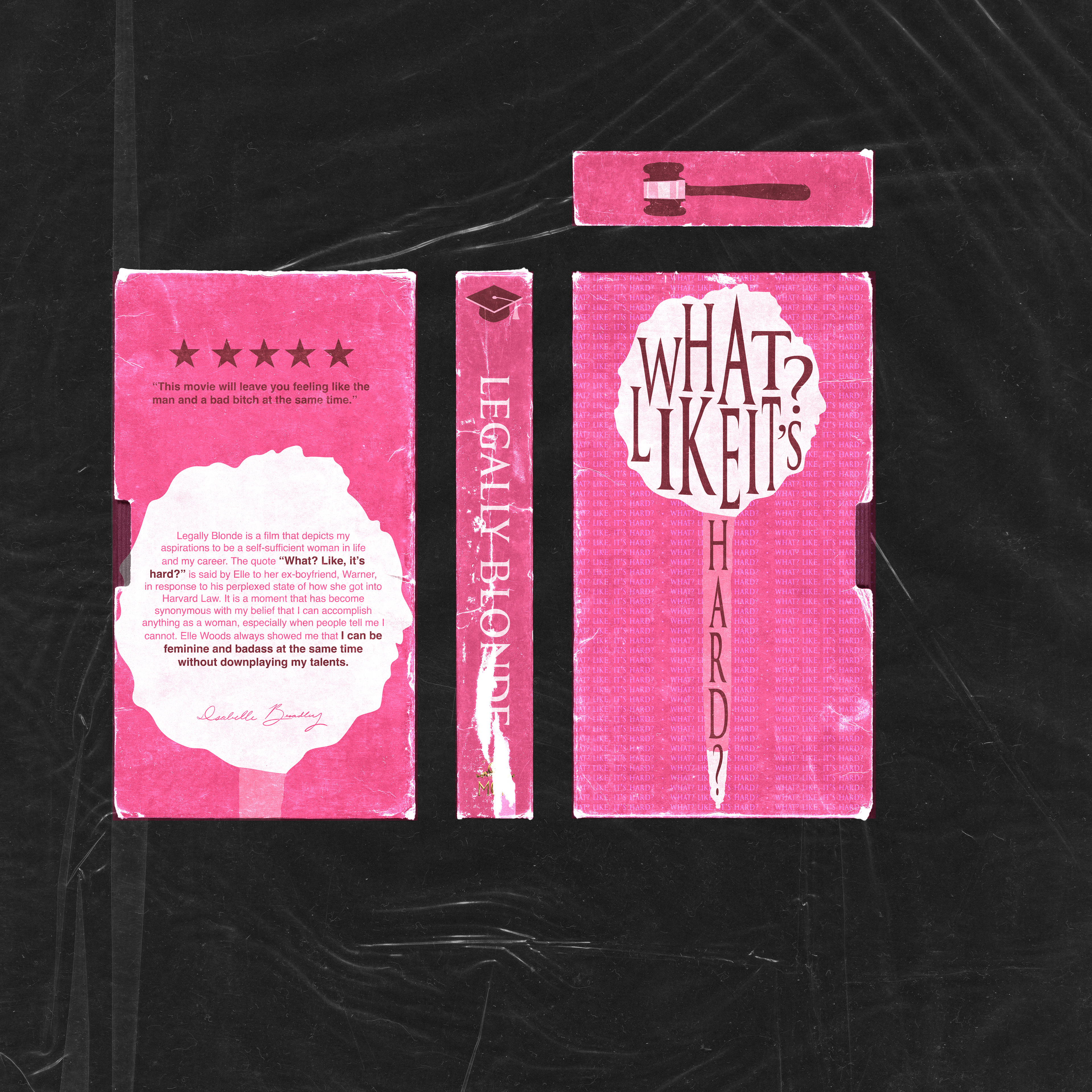
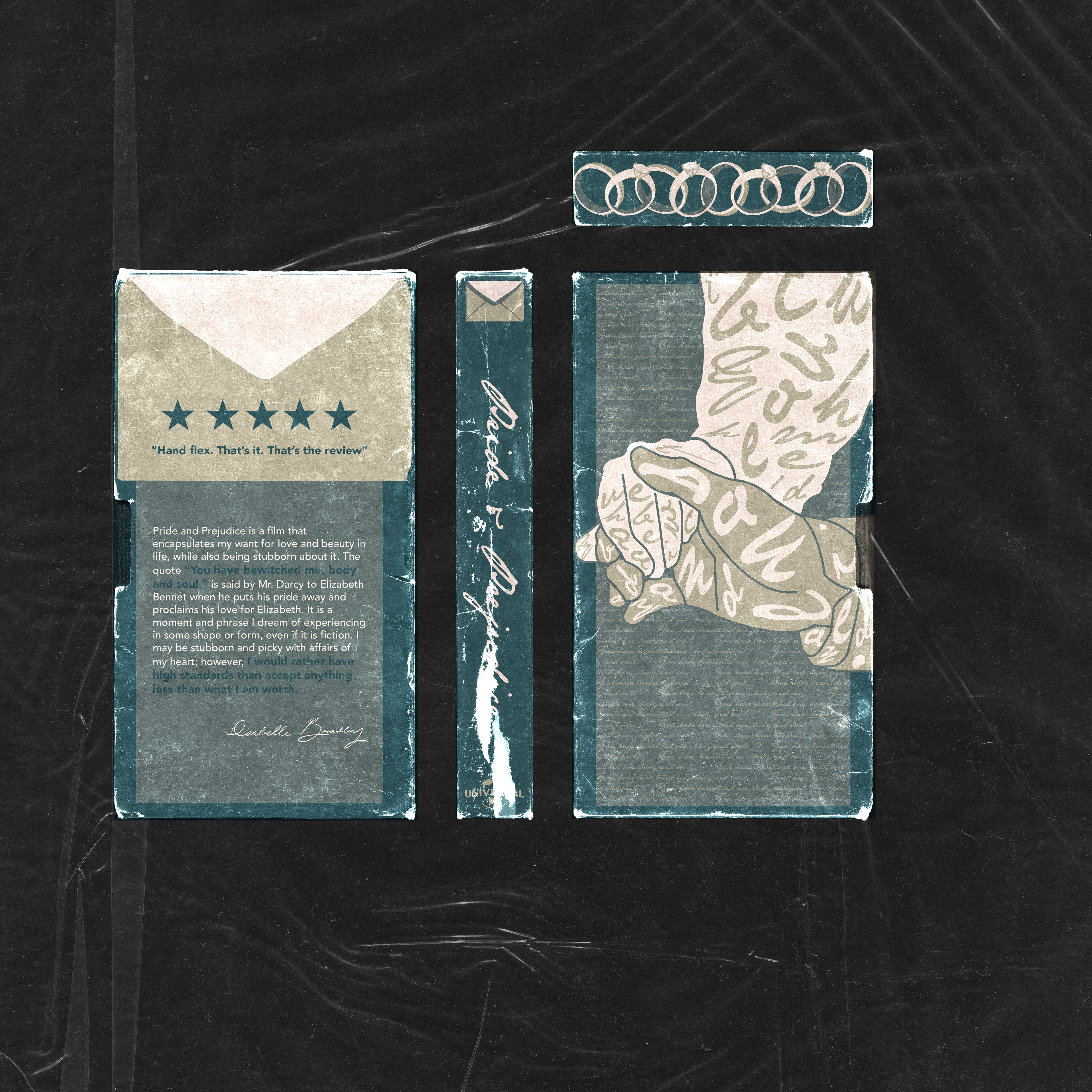
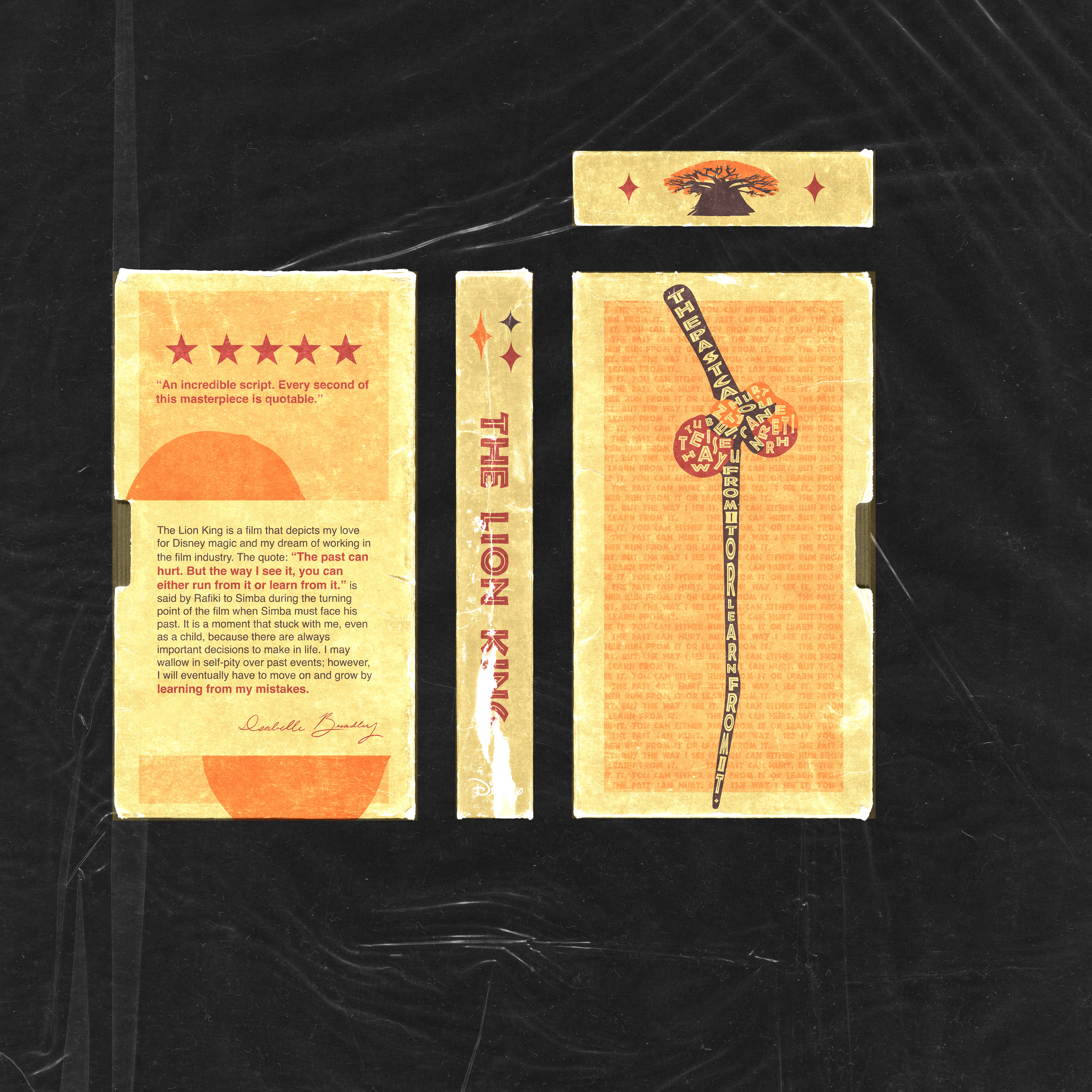
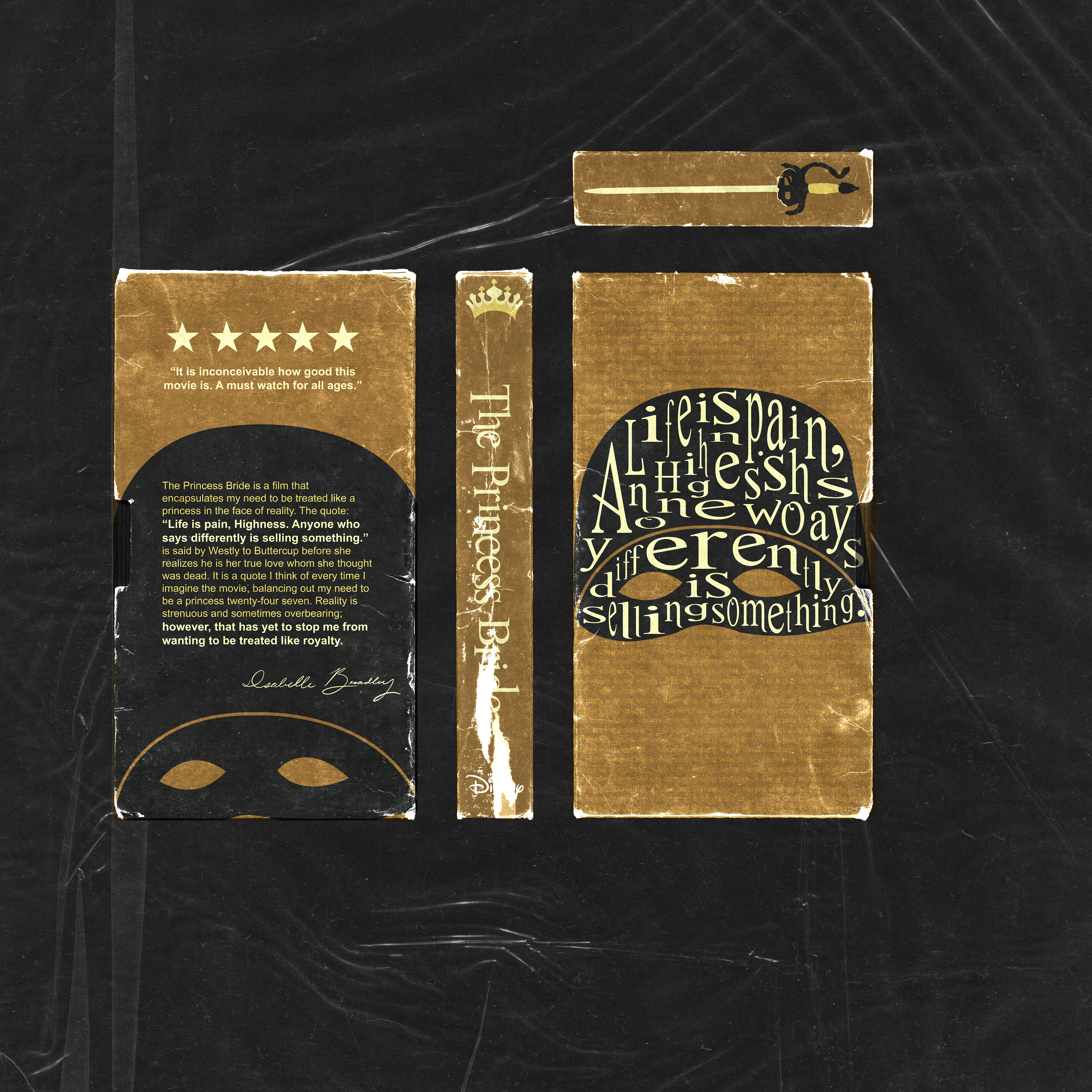
I have created a collection of VHS sleeve designs using a typographic style to convey the significance of the comfort movies I have selected. Designing VHS sleeves appealed to me as it offered a distinctive opportunity to juxtapose the films I currently cherish with a nostalgic packaging style reminiscent of my childhood. I utilized a flat design technique, incorporating text overlay to introduce texture and dimension. This approach ensured a cohesive process across all seven VHS designs.
My design merges contemporary elements with traditional ones, reviving movies by imbuing them with dynamic typographic elements. Words are how I connected with these films, which is why typographic elements are throughout each design. I chose the quotes based on what they meant to me at this point in my life and how they continue to influence me. When designing these VHS sleeves, I sought to explore the components that bring comfort in these movies to me. I aimed to ensure viewers could grasp my film journey through my work.
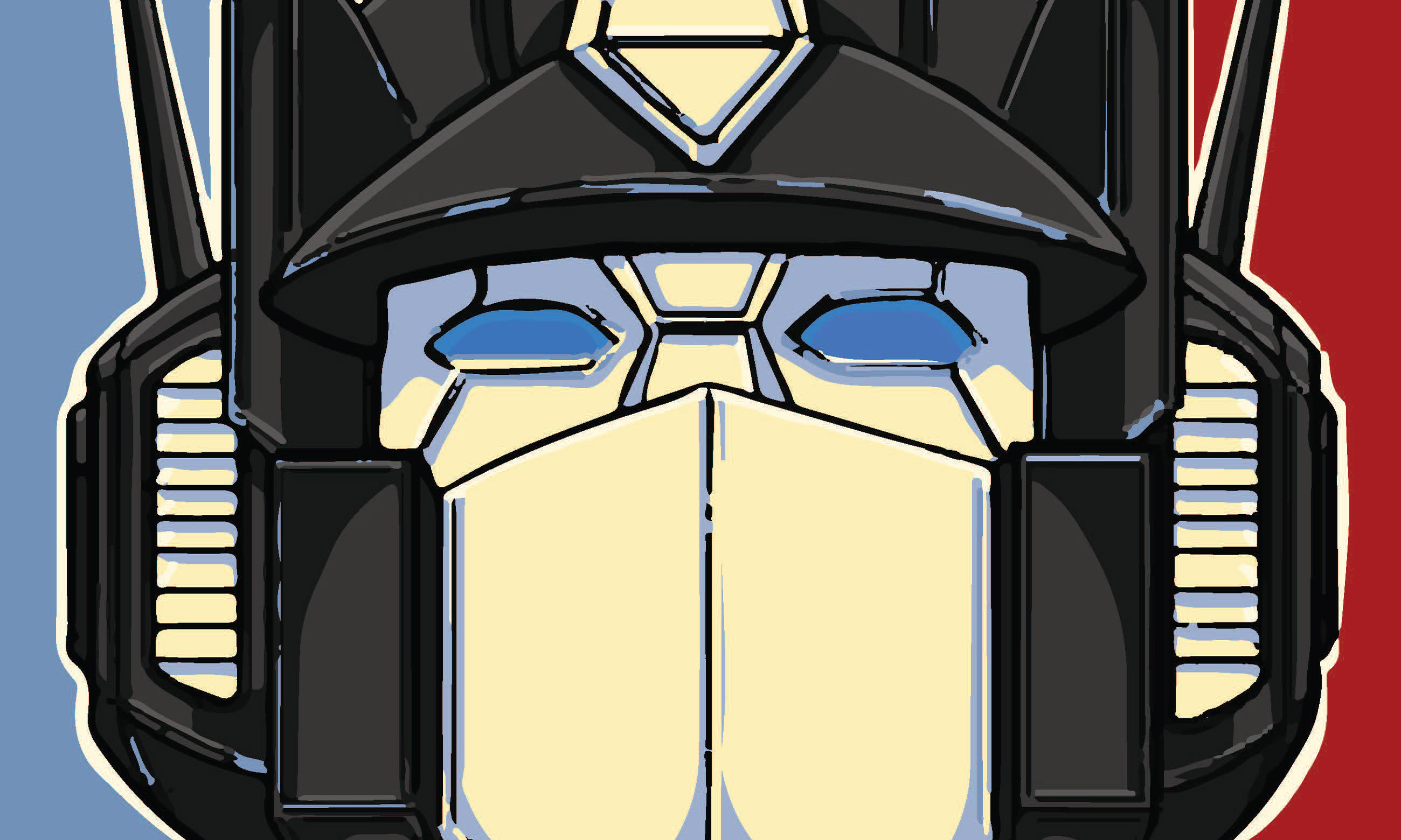
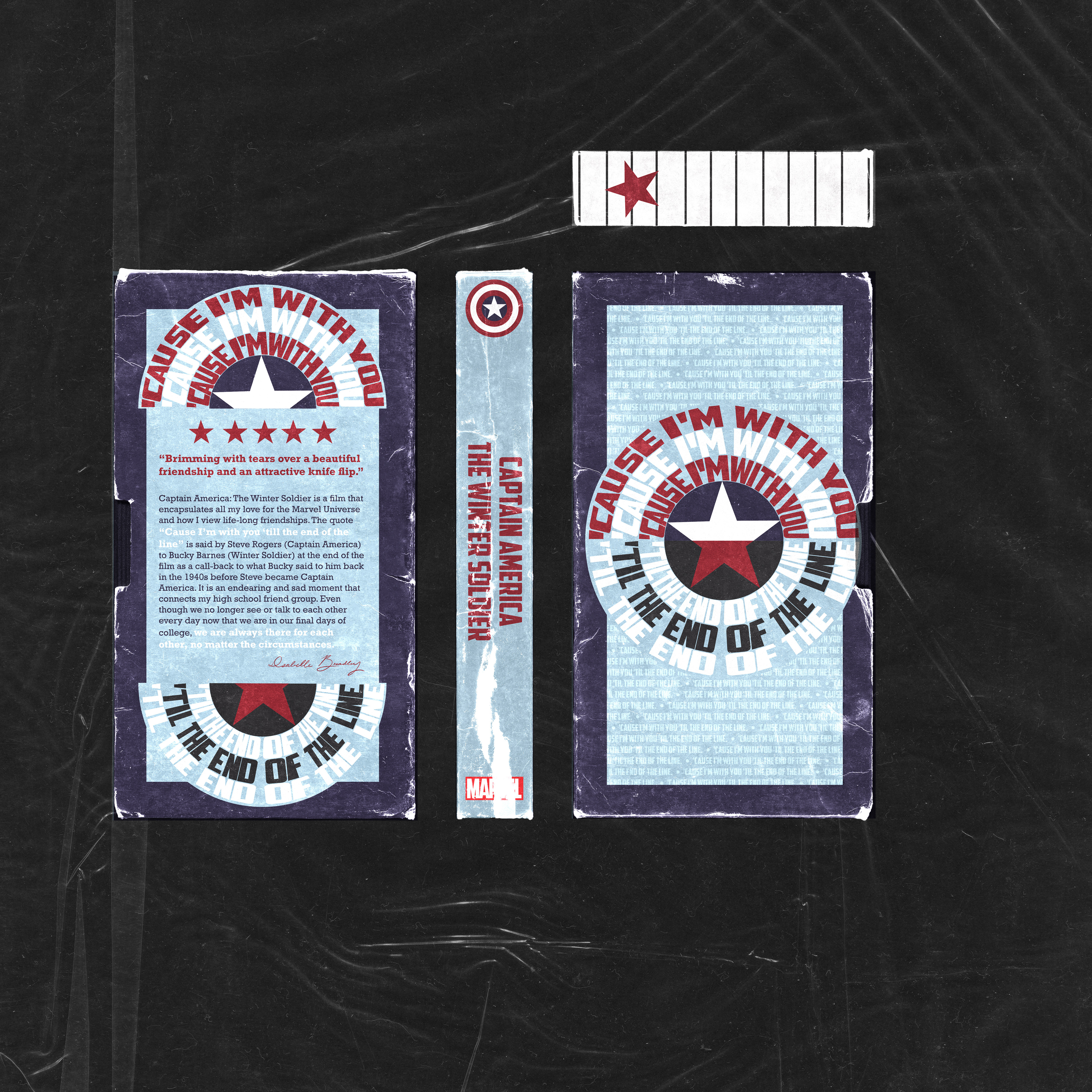
When others view my work, they will see how films can be viewed through a unique lens when combining visual elements with typographic ones. My inspiration for my designs came from a combination of typographic designs: Michael Bierut, Paula Scher, David Carson, and Gail Anderson. For my Captain America: The Winter Soldier design, I crafted the iconic shield by incorporating text from a movie quote inspired by Gail Anderson's design style. Other than famous designers, what inspired me the most was my inner child and my desire to bring stories to life.